End Credits

Once I finished gathering the renders for Rachel to put the edit together, I offered to help out with the end credits so she sent me this tutorial. I still have quite a bit of work to do on them for the end of year show.


Alphas I created as a border and divider for the text:

Things to add and fix:

  • Extra thanks to those who helped us out, a.k.a. Ruxandra GP, Mark Lisk, Matthew Hamill, Seana Leach, Jonny Rooney, Daniel Pelan, Mike Bass.
  • Make a separate Studio Lighting moving layer for each text layer as it looks better in some than others. It messes up along the middle detail between Tony McQuillan and Andrew Coyle’s names.
  • Spending more time on the borders and dividers.
  • Perhaps I could create simple house sketches, or a street lamp.


Lighting and Setup

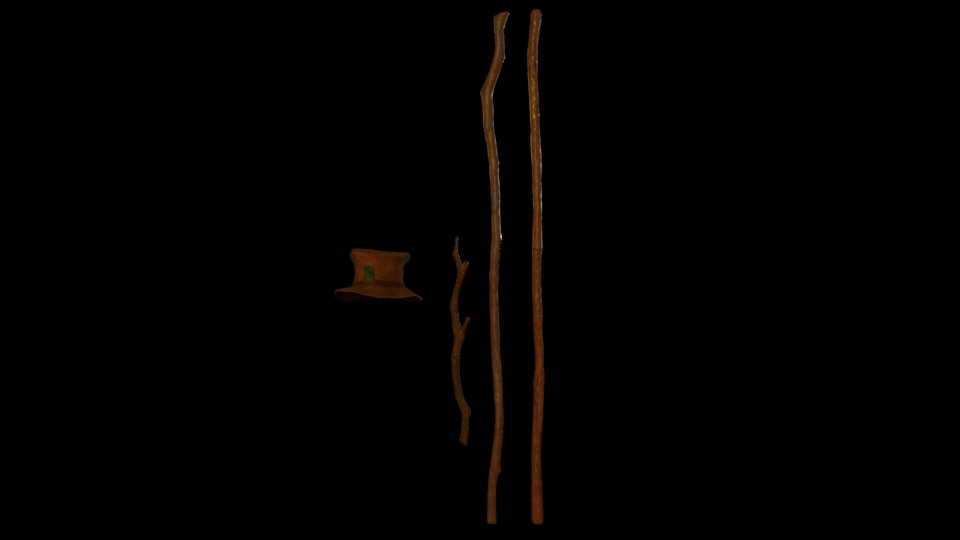
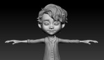
I completely lit every scene within our short, excluding the stick in one or two shots. I also lit the characters in every shot. Rachel did the complete setup for SQ01, excluding lights and completed SQ05 of which has to be changed and added to the final short film. She also did the base layout for SQ03/SQ04/SQ06/SQ07, of which I went in to change houses and add props and lights.

I studied lighting within arnold on solid angle and looked at changing shadow colors to make them cool at the beginning and warmer towards the end of our short film.

 Psychology of Color in Film

Document Link


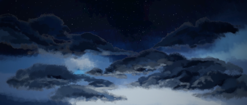
These are the relevant colors I used throughout lighting our short film. I wanted a clear contrast with a cool night sky against the warmth of the lights, and the warmth within our story between our two characters. As seen above, orange represents warmth, friendship and happiness, so I used peach and orange lights throughout. Our short film goes from blue skies and warm street lamps to a warm sunrise. In our end shot, I used purple shadows to represent a sense of magic with warm skies and soft lighting.


Wes Anderson/ Robert Yeoman


The Grand Budapest Hotel (2014) was my main inspiration for lighting our scenes. I loved the saturated colors, and although our short film is not overly saturated, the colors are still very vibrant. The saturated colors represent a lively and happy environment. It catches the eye and is almost dream-like. I especially loved the contrasting peach street lamps against the cold, blue environment, especially against the cobblestones, however they reflect against them so clearly because the ground is wet.

Wes Anderson makes heavy use of symmetry throughout his films. He avoids angles where lines aren’t parallel and uses the rule of thirds. Wes tends to center his subjects in the middle of his shot but uses the thirds to create a stylistic imbalance on either side.

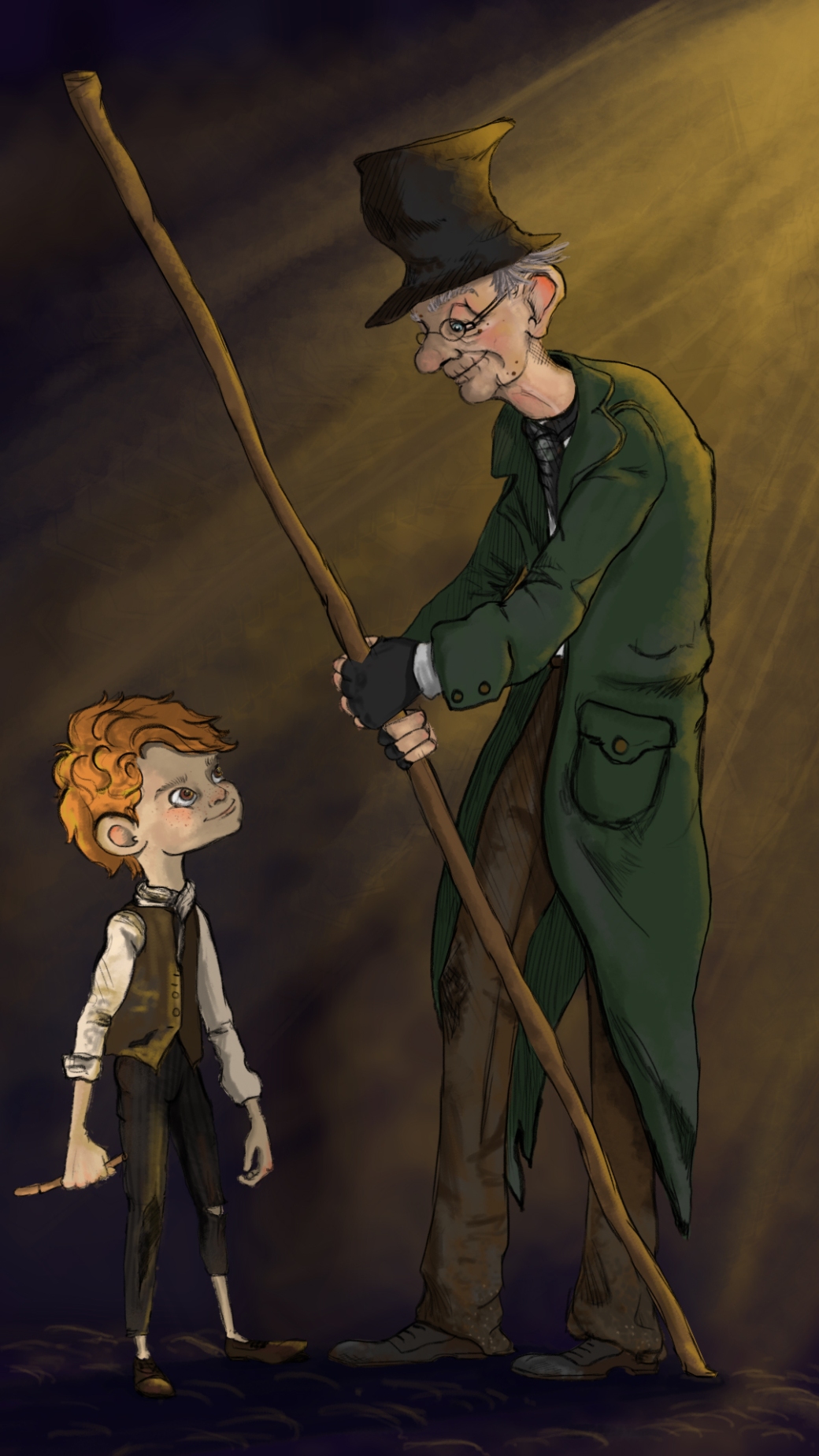
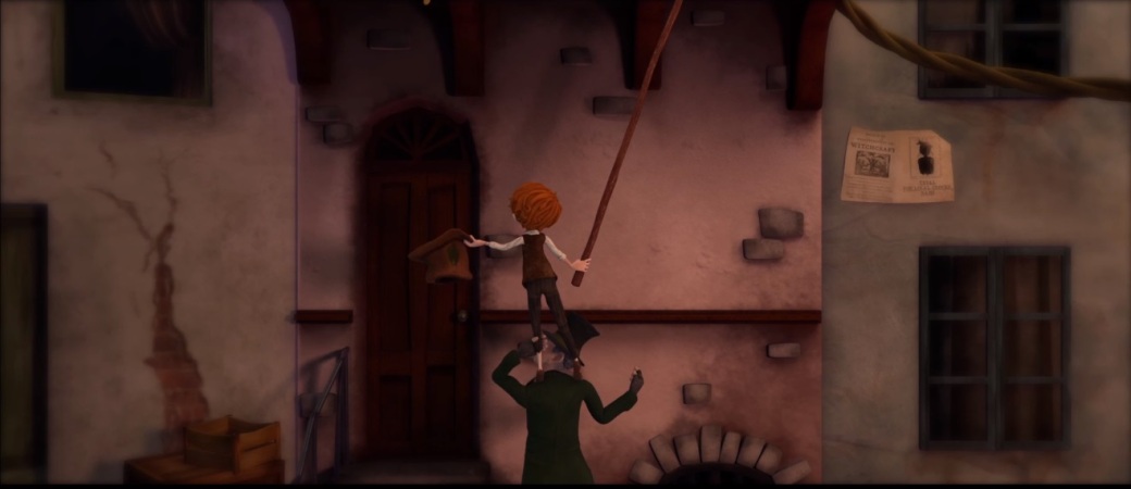
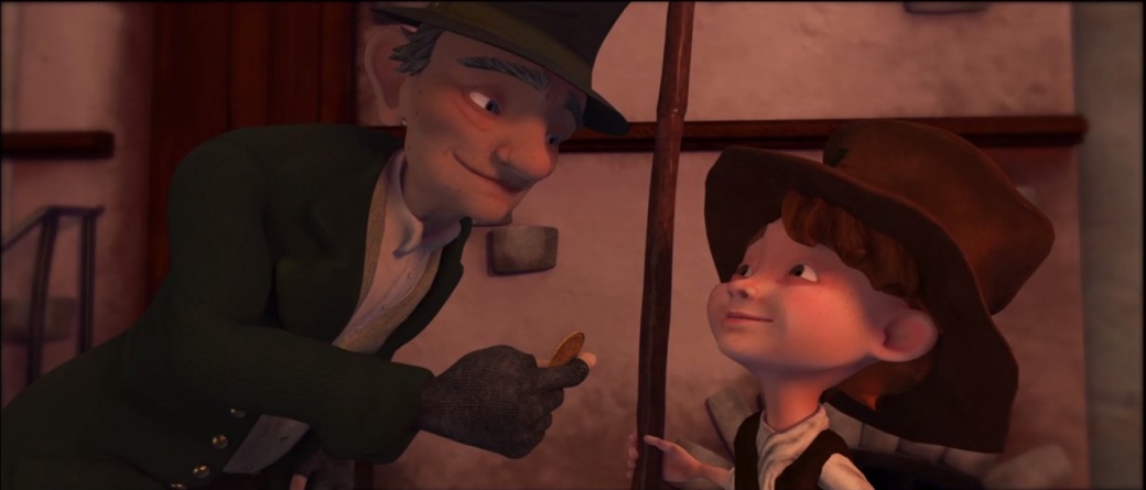
Rachel and I took great inspiration for the centered shots of Wes Anderson when subjects interacted with objects, such as shot 13 when the money falls into Walter’s hand :


Planning

Rachel added a lighting tab to our google sheets to show the completion for each shot. A sky tab was also added, however there was only a need for 6 setups, of which I finished 4 setups, and lit 5.

  • Walter House setup (SQ01)
  • Walter Walkthrough Street (SQ02)
  • Main Street (SQ03)
  • Forked Street (SQ04)
  • Winding Street (SQ05)
  • Final Street (SQ06/07) – Lighting was simply changed and two houses switched in for shot 26.
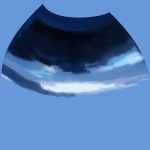
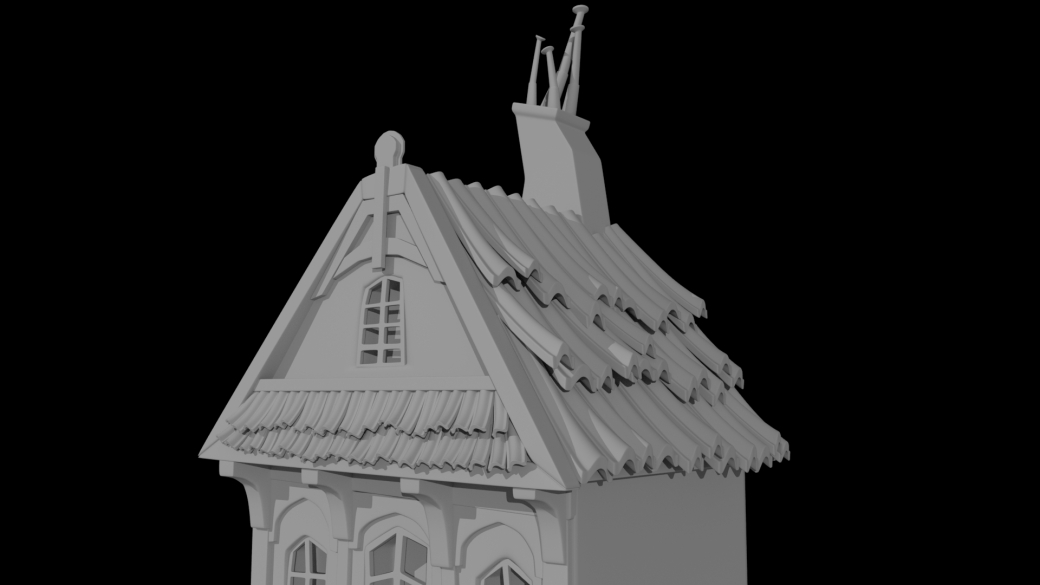
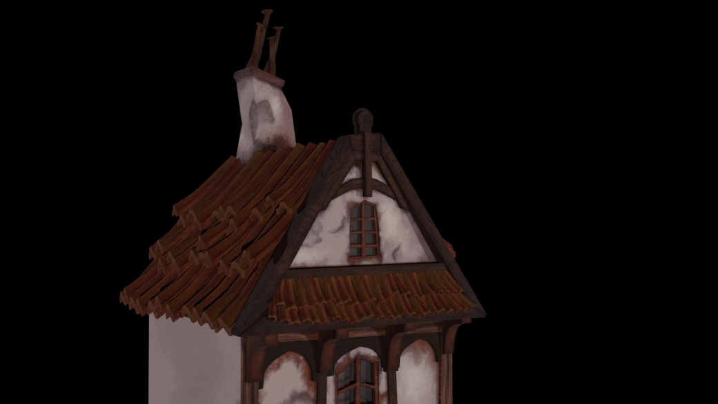
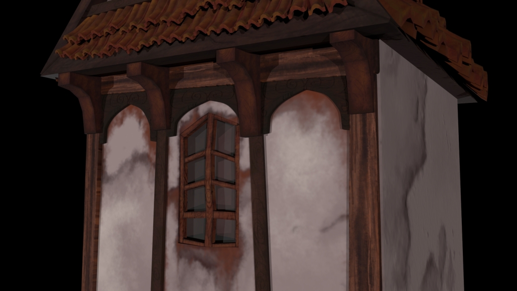
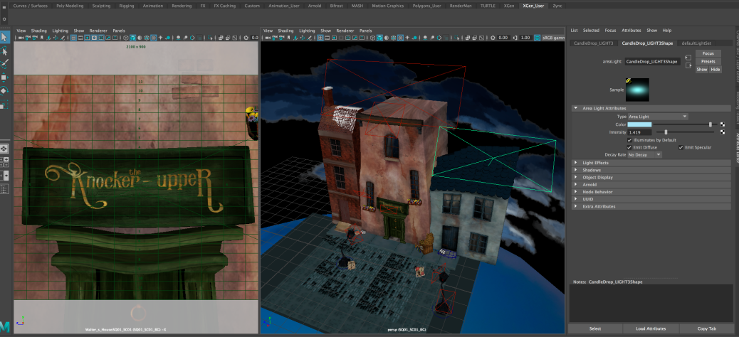
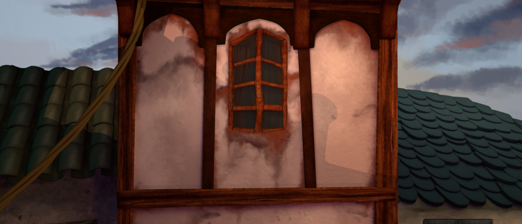
walt_41

walt_40


 SQ01

Towards the beginning of our short, I used peach and orange lights from the street lamps, and some pale blue lights against the roof to represent moonlight. We have a pink house that I enhanced with peach lights to represent our warm short film and our sweet old character, Walter.

Screen Shot 2018-05-17 at 14.23.44


SQ01_SC01_BG.0380

Final Render: Color Layer needs added to Greta’s roof on the left in editing

Image converted using ifftoany

Final Render


SQ02

I completely set up this scene and lit it. Although Danny added some props, I ended up deleting and replacing most to frame the environment better. My main inspiration for this shot was a student film, Rubato:

rubato_01

Short film ‘Rubato’ (2016)


The layout of the cobblestones that I made was what took the longest when setting this scene up. I had to form them into a squarish shape and instance them numerous times. It was quite difficult to get them to form well along the curved pavements but I managed it in the end. We also re-used this floor for SQ06/SQ07 which was handy as it was also a flat ground.

Danny_SQ02_01

Danny added props and assets

Screen Shot 2018-05-11 at 12.22.44Screen Shot 2018-05-11 at 12.23.34

I changed props around and placed lamps and lights where necessary to light the ground and character, so I tried to place the focus towards the area where Walter walks. I also loved the chimney’s in the foreground in Rubato (2016) so added this to ours. I placed pale blue lights against them to represent moonlight. I thought this was a nice contrast to the warm lights on the street and character.

SQ02_SC03_BG_setup

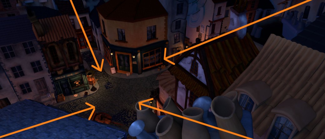
Leading Lines Played an important role throughout my setup as I wanted to frame the characters in each scene.

SQ02_SC03_BG.0001

Final Background Render

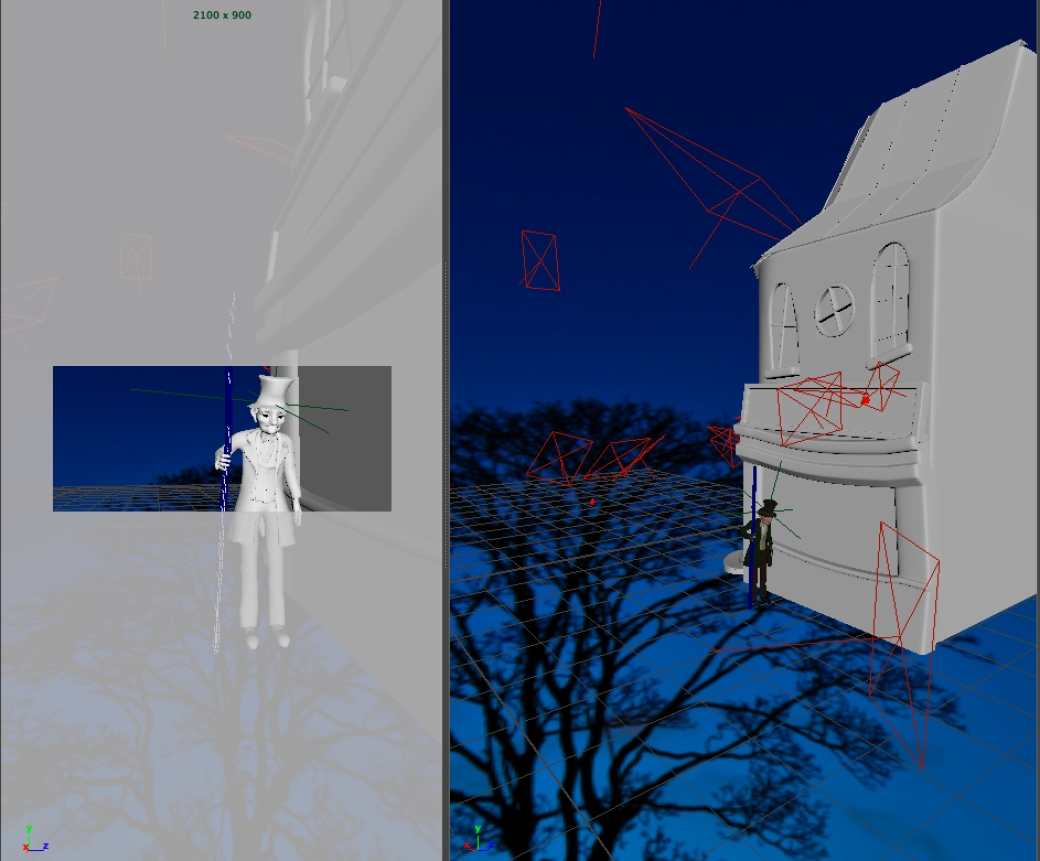
Attempting to Light Walter:


SQ02_SC03_WALT_LIGHTING_003

Resulting Character Lighting

walt_21

Rachel edited the character and background layer together and added depth of field
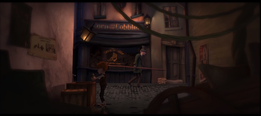


 SQ03

33044145_10216829944639817_5102988383978782720_n

Rachel’s Initial Setup for SQ03

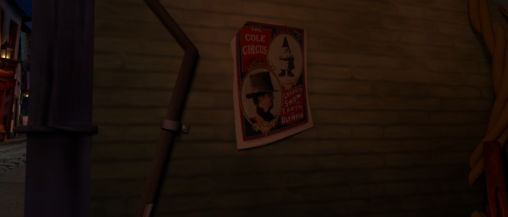
I replaced a lot of the houses within this scene, and set up the props. It was difficult to get the lighting right in the alleyway scene. To make the area darker to take away from the hdr skydome lighting, I added a simple box to cover it and shade from the blue lights. I had to make the buildings in the distance look more realistic so added more blue lights to resemble them fading into the sky. Finalising the lighting:

SQ03_SC09_bg.0200

SQ03_SC09_bg.0300

SQ03_SC06A7_bg.0001

Final Background Lighting and Setup

SQ03_SC04_bg.0001

Initial lighting

SQ03_SC04_bg_02.0001

Adding blue skies for window reflections

SQ03_SC04_bg_03.0001

Warmer lights and shadows

SQ03_SC04_setup

Within this shot, I used the props to form a frame leading the eye towards the focus of Samuel who will be beside the crates.

SQ03_SC04_bg_04.0001

Final: Adding specular highlights

walt_22

Final Character and Background Lighting

walt_23

Final Character and Environment Lighting
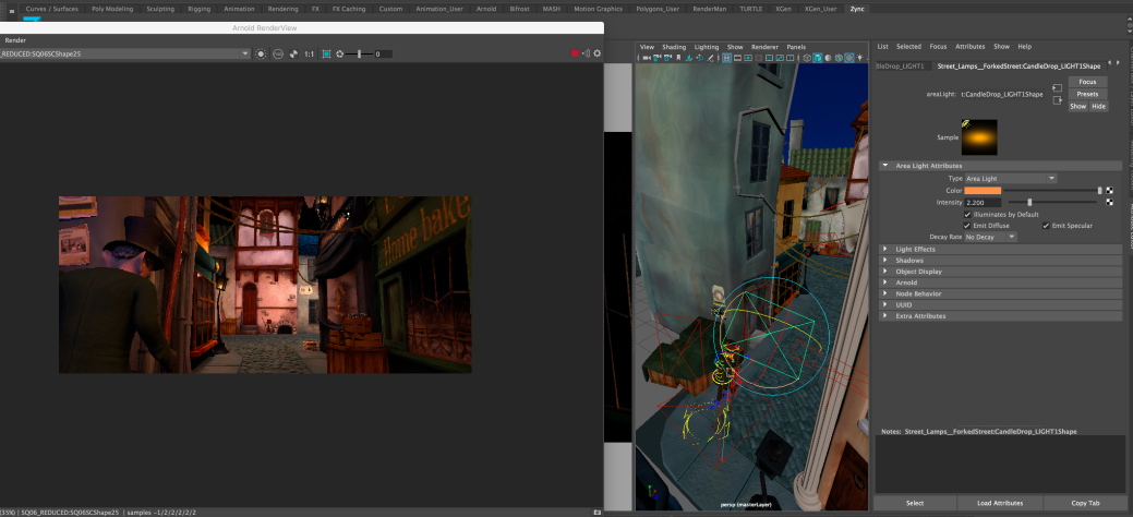
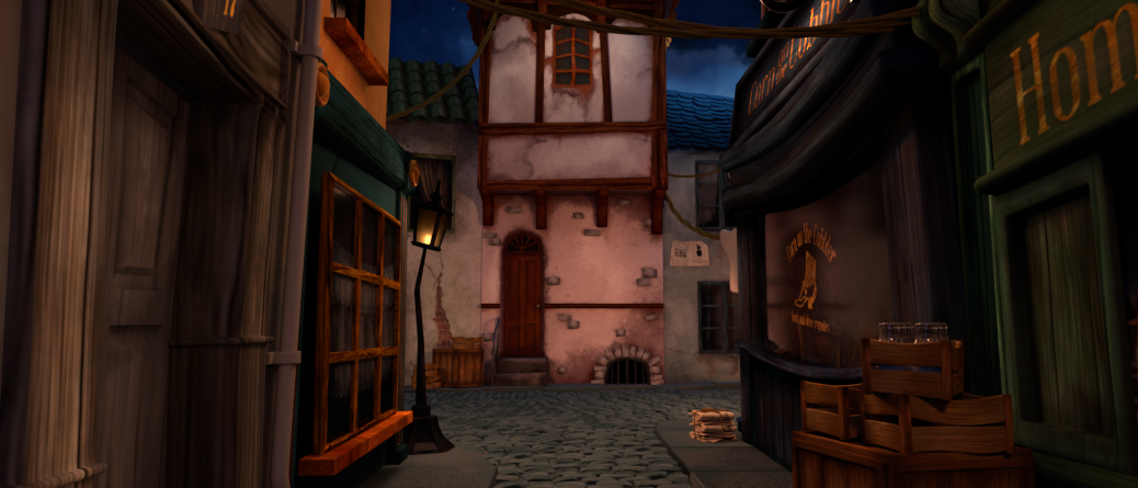
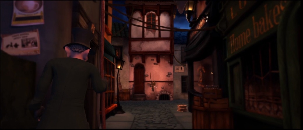
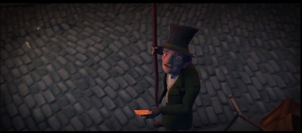


SQ04

33022302_10216829936239607_6604074935625187328_n

Rachel’s Initial Setup for SQ04

Within SQ04, I had two skies; one on either end. Rachel showed me how to place a lattice on houses to change their shape to suit the hill. This scene was the largest file to work on, so it came with a lot of issues such as the ground not showing up in certain areas and it was difficult to keep loading. I did consider splitting the scene up into two backgrounds, but I managed to continue working on it. I wanted a very warm feeling within this scene, as it is where the characters first interact with each other.

House Layout and lighting progression

Prop Layout

When placing props, I stuck to our animatic and focused on where the characters would be and filling in empty gaps. I tended to place Greta’s milk bottles that I textured and the newspapers/signs next to the houses and shops. I also placed Rachel’s rope and hanging cloth in between the houses to make the town seem more livable and realistic.

forked_street_023

Character Lighting

I tried to keep the character’s quite warm with peach and orange lighting and placed Rachel’s wall lamp on the house above them in the scene where they interact with each other. I also placed a huge blue area light above them to represent the moonlight from above.

One of our initial problems was a mistake of my own. I didn’t realise that the character’s faces had recieve shadows turned off, as you can see the difference below. The impact is huge. Recieve cast shadows turned off vs on (left to right below).

Some Final SQ04 Renders

Although I lit both the characters and backgrounds, Rachel comped them together in after effects and added depth of field within it too to help the characters stand out more.

walt_32

walt_26

walt_24

walt_25

Some Final Background and Character Lighting and Setups
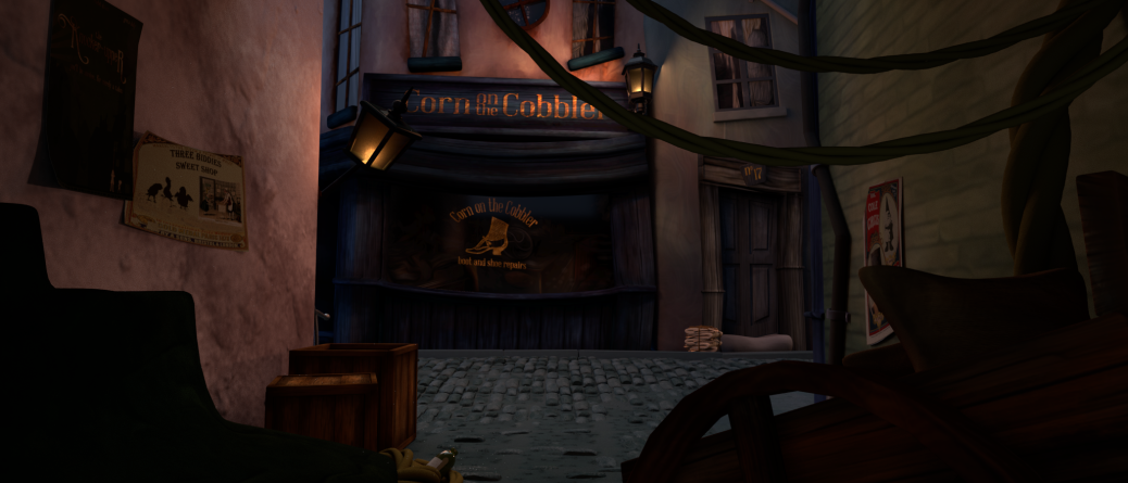
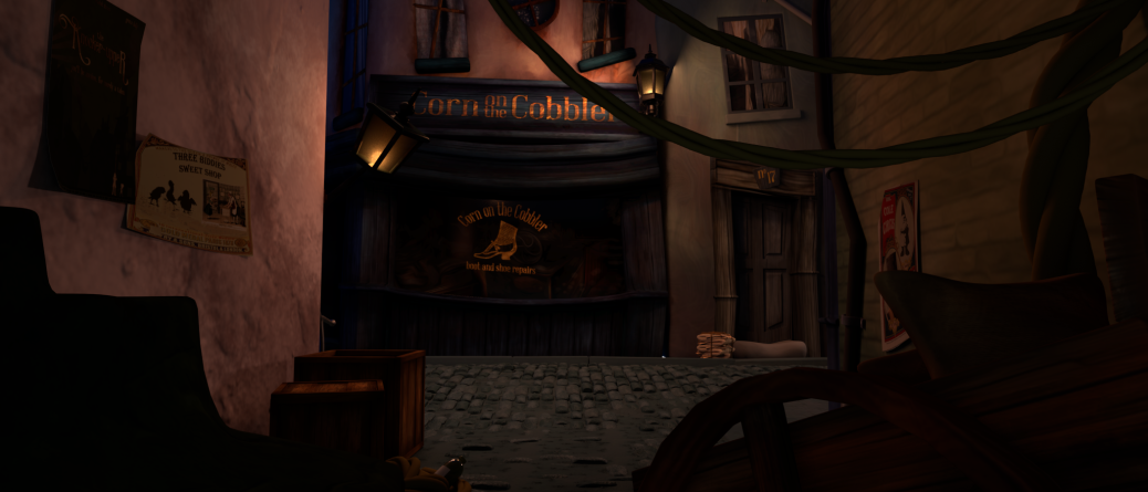
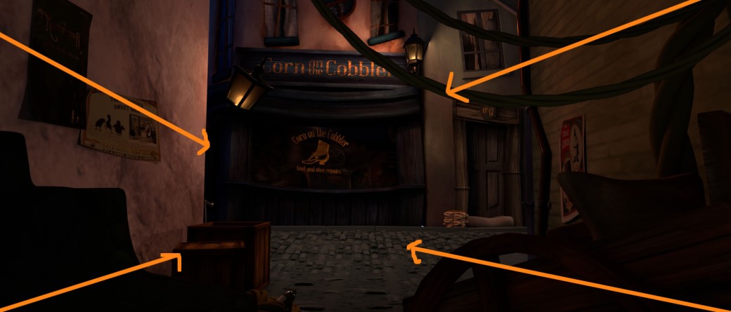

SQ06

Rachel’s initial setup for SQ06 and SQ07:

I had to switch in a few different houses for sc26 for Walter to be seen as it was an awkward angle:

Screen Shot 2018-05-17 at 16.55.57

SQ03_SC00003

Resulting Background Render SC26

walt_42

Final Character and Background Lighting and Edited Render

Screen Shot 2018-05-13 at 15.04.41

Light Setup for SQ06

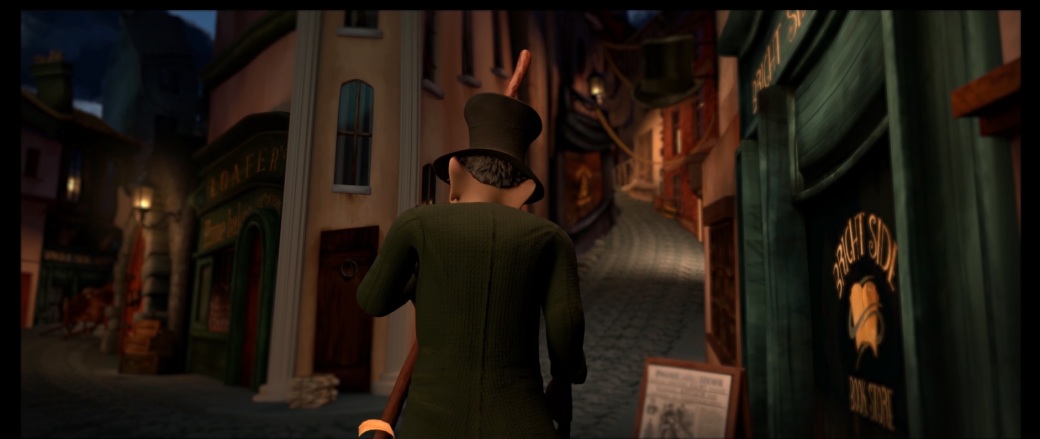
What I enjoyed about working on this setup, was the influence of Wes Anderson and symmetry. I used the imbalance of the posters on once side against the shop on the right to lead us towards the rope framing the house on either side:


BLAH.png

Leading Parallel Lines like Wez Anderson and using the ropes to frame the window


SQ06_002

SQ06_001

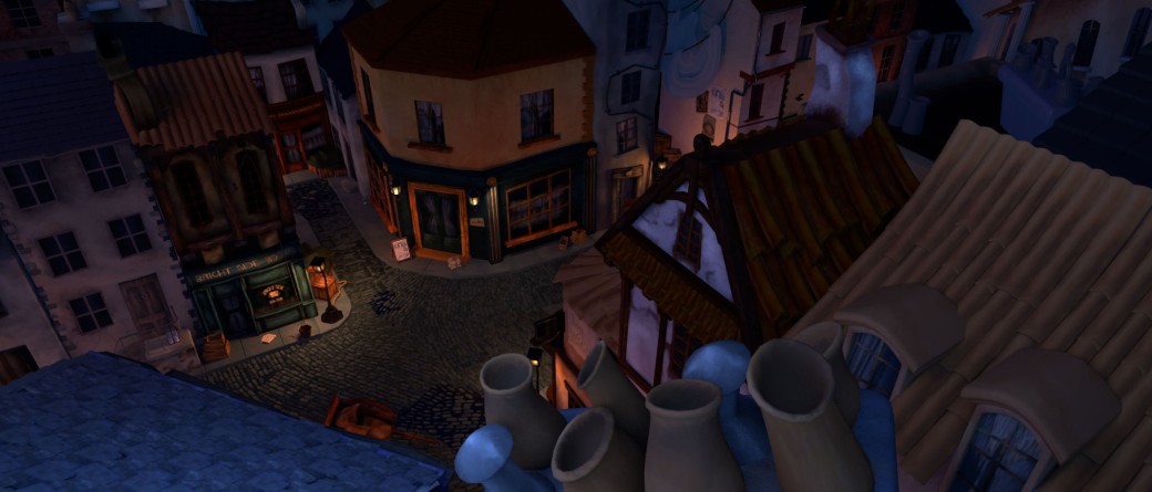
Final Background Lighting and Prop Layout


walt_27

Final Background and Character Lighting and Edit


walt_28.jpg

I tried to keep this lighting quite cool to contrast the time passing for the next shot. Rachel added a lovely vignette and depth of field to keep the focus on the character.


SQ07

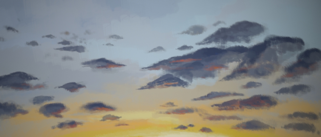
I used my painted sunrise sky for this scene and a warmer hdr to achieve the look of a sunrise. It was also quite difficult to achieve the shadow on the final house. As seen below, I stretched a building within the scene to create a casting shadow and placed some random chimney pots above it. What created such a clear shadow were the two spotlights from behind. I also added some more peach lights against the rooftops on either side of the main building.

SQ07_002

SQ07_001

Final Background Lighting for SQ07 (Sunrise Lighting)

walt_29walt_30

walt_31

Some character lighting for SQ07


Animation Progress and Research

I sent this to the team to show the progress from layout>blocked animation> final animation

Link to Spreadsheet to keep track of animation phases and completed shots to start rendering.

As I was mainly working on the Environment layout, lighting and rendering, it was initially planned for me to do just a few animation shots after being blocked as I am less skilled at animating than the others, but I put time and effort into them. In all, I have (so far) completed around 35-40 seconds of animation.

I completed the blocked out shot 04 and 05, animated shot 12 fixed up some of shot 11, and redid shot 07.


SQ03_SC04

Rachel blocked this out for me:

Firstly, I took it into syncsketch and drew inbetweens to give me an idea of where to build off of.

What was of great help to me was Tween Machine.  It helped me hold poses so simply and helped me determine which keyframe to favor more (first or last). It really helped speed up the process.

Keith Sintay

When I went to Dingle, I went to Keith Sintay’s animation workshop. It was so useful and he went into great depth when discussing animating in maya and went on to show us a short demonstration. He blocked poses every 10 frames, then every 5 and so on. However, he did not stay in stepped animation for very long and explained how he splines the animation very early after getting a blocked out sense of time as going from stepped to spline is often a game changer (of which I wish I had known long beforehand). He also mentioned using atools, which is free to download and is installed by simply dragging it into the maya scene (I was so impressed by this).

Some helpful tips

Working as part of a team:

  • Don’t expect to be given great shots to work on when starting out.
  • Keep any irritation at people within.

Composition:

  • Foreground, Mid-groung and background elements should read clearly.
  • Stick to the rule of thirds.
  • Have clear silhouettes.
  • Asymmetry is more interesting.

Workflow:

  • Work in linear animation, not stepped.
  • Do as much in the workspace as possible and not the graph editor.
  • Take breaks.
  • Know the context of your shots.

Spines:

  • Bipeds use an FK Spine.
  • Start with COG (center of gravity) then work up the back.
  • Fingers have a tendency to lean towards the middle.
  • Turn off weighted tangent and turn on auto key.
  • Animate on 5 and 10 to gauge the timing.
  • To check COG draw a line from the pit of the neck down to the inside of the foot.
  • Always check animations from above.
  • Get ATools!
  • Use animation layers for breathing cycles and laughs.


32313085_1772130976202017_3068076881073930240_n

I did try aTools but I don’t think I got the chance to see the full extent of how useful it can be. Its useful for creating my own buttons for selections. This was useful for selecting the whole rig to be able to change timing within the graph editor. It also has tween machine installed within it which was handy. Although Keith Sintay only showed us a small portion of atools, I had a look at this tutorial. I think it would be extremely useful if we had to do lip syncs so we could create our own keys for vowels.

Drew Adams

Drew Adams had some helpful tips on working from a blocked animation to a splined animation. I found this quite difficult to start with.

Some helpful points made:

  • Start with the hips then move up the spine. Finish with the head.
  • Nail timing in stepped before switching to splined mode.
  • After switching to spline, check the moving holds.
  • Clean the graph editor to clean up the curves.

Stepped Further:

Splined:

Feedback

Alec‘s feedback: lengthen the time he is crouched to give him more weight. Exaggerate the end pose when the character is in the box- legs are high in the air. Flop back down.

We used syncsketch for feedback:


Rachel:

  • Hands and fingers remain bent up as they fall.
  • Keep feet flat until the legs straighten then add the heel/ball rotation.
  • Arch back towards the end and have him slump after throwing the bottle.
  • rotate shoulders more to emphasise the body throwing.

Final Playblast in my environment setup:

I also fixed up the sticky hand issue where he holds the bottle for slightly too long. It was more difficult because I had to switch between two bottle rigs (one connects to his hand and the other alone). He does have facial animation, but it’s a little difficult to tell side on.


SQ03_SC05

Rachel’s Block for Sq03_sc05:

Before working on this shot, I realised that I had far too many keyframes at the beginning of shot 04 when trying to work on inbetweens so it was quite messy by the time i went back to splining it. I tried to make it easier for myself and do less inbetweens and work with tween machine and splining. I made linear tangents when necessary to stop sliding issues, as Drew Adams discussed fixing the moving holds first when transitioning from stepped to splined mode.

Stepped further:

Splined Progress:

I had to erase the blocked out translations when he walked because it would cause a lot of unnecessary drifting, so I still need to focus on getting the walk right. He looks like he has a bit of a limp. I also changed a lot of the previously blocked out animation but the timing is still there.

Feedback Before Facial:


Rachel’s Main points:

  • rotate hat higher at the beginning and samuel’s back. Have him look up at it as he is initially proud of his find.
  • After he sees the hole in the hat, he is disappointed and saddened. Show this.
  • Have him slouch in a deep sigh as this gives the animation and slouching more purpose.
  • Keep eyes locked on the old man as he is turning to look around the corner.
  • Settle hand slightly towards the end.

Rachel also helped me block out the walk again as I was having issues. I hope to work on this for a while after hand in to perfect it for the end of year show. Looking back on it, I feel it is quite stiff.

Playblast in my finished background setup:

Further Animation:

Rachel had added blendshapes to the hat so I tried to animate it slightly. Alec also thought the arm raise at the end was too weird as it looked like he was trying to lean against the wall so I cut that out and kept it relaxed.


SQ04_SC12


After Rachel’s Blocked Animation :

I was using the given time frame as I didn’t realise we could go out of this as we had music created for us, however I know it is definitely far too fast.

With feedback review:

  • slow the start right down.
  • hold some head poses looking at the stick.
  • Move hand with arm.
  • Curve shoulders more towards the camera when bringing the stick around.
  • have the shoulders nearly side on when looking up.
  • Have head relax after shoulders and so on towards the end.

Further Adjustments:

  • Bring thumb up before settling to grab on the stick.
  • Fix stick swinging too close to the camera.
  • Stick jitters in one place.
  • Make back of neck move when shoulder relaxes at the end. (couldn’t do this because of rig limitations).

Ready for facial:

Final Playblast:

Alec suggested we have the coin start to fall in this scene to follow through to it landing in his hand in the next shot. Rachel added this in before we rendered the shot.


SQ03_SC07

Greta had animated another version of this before the hand in, however she didn’t animate it enough. It was simply too subtle and she hadn’t animated the right hand, so I went over it and ended up having to completely begin again because it would be easier as it’s quite a short animation. I redid the watch animation also with a rig connected to Walter rather than the separate rig, as this meant it would move smoothly with the character.

I think I could make it slightly more subtle if I have time to go back over it before the end of year show. The time in the card has also changed to 4am.


Editing SQ04 SC11

Rachel had given Greta some feedback when it came to this shot as the initial plan was to have Samuel appear from behind the wall.

I edited this to save some time, while Greta worked on trying out zdepth on the background renders within nuke.

Final Animation Edit

The edit of my animation input:


Character and Scene Props

Over Christmas, I did further research into Assassin’s Creed Syndicate (2015) for props for our short film. I opened up my game and explored the world a little. I sent these images I took to Rachel and Greta for them to model some crates and as ideas towards the typography within our short, shops and houses. I particularly love the crates of wine and love the posters that fill up the game.


I was at my grandparents over Christmas and found some great little assets that we could use within our short, like the oil lamp for the bedroom if we kept that scene, the pocket watch and some coins.


Walter Props

Pinterest Board


Sculpts:

For the stick models I used the trim dynamic brush within zbrush to give it a hardened sculpted look like the sticks in the image above. I then used the damstandard to sculpt in the finer detail like the image on the right and made them slightly stylized.


Samuel Props

Pinterest Board

909181ca7a420089c53ef4bb80aebbab

I compiled Samuel’s hat, stick, Walter’s main stick and the first knocker upper stick onto the same UV tile so only a color map, normal and roughness was created and applied to each to save space.


Some alphas used to texture some clothing and Samuel’s hat:


character_props_render_015character_props_render_014


Posters

Many of this year’s short films have found ways of incorporating little fragments of other people’s projects. Beaky Blinders have added the Brightside teapot into their short film as well as our hat amongst other surprises. Brightside had a shelf of video tapes dedicated to projects and older projects from our year’s work. Amy Seaman added a keychain with pieces of some of our projects such as our knocker upper hat, Matthew Skelly’s acorn, a teapot etc. Natalie painted project versions of famous horror paintings.

After seeing the really simple posters in Assassin’s Creed Syndicate (2015), I thought it would be a really lovely addition to fill up empty spaces and create nice framing in some of our scenes with some posters, and adding a little something from some of the other short films and games.

POSTER_RENDERS_004

Greta made the base of this standing sign, but I created newspaper clippings to add to our scenes and based stories around characters from other projects:


While going through Greta’s miscellaneous assets and buildings I changed tones of buildings, quick paintovers, darkened windows and retextured some assets. I retextured the glass milk bottle (looks best fully rendered), added milk, created the gold on the signs for the three biddies sweet shop and h.h. holmes butchers to add to the previous newspaper clippings. In the butchers shop, I darkened the window and retextured the other assets. Of her files, I also went through each and every file and reconnected textures/ froze transforms/ deleted histories so that each asset was ready to import


I tried out a couple of different shades for the cobblestones, but once tried out, we preferred the blue tint as the orange lights worked well against these.


I also made some concrete slabs for the sidewalk to match. I made them reversible and the squares even on all sides so that they could be rotated also so we technically had 6 different objects (excluding rotation):


Sky Progress

As some environment layouts had been completed, it was time for me to figure out the best way to create the sky so we could begin rendering. I did attempt to create clouds within maya using the tutorial below, however, photoshop and two curved planes were a lot easier to manipulate and create.

  • Shading: Edge Dropoff- feathering the outside of the container

I had issues rendering with arnold so tried following these guides:


4AM SKY INSPIRATION

I gathered some images of skies and showed them to the team. We figured that a darker cold sky would create more of a contrast to a warm sunrise.

6AM SKY INSPIRATION


Maya Software Render vs Arnold Renderer

Following the tutorial proved to be a lot more difficult than I imagined. I did not achieve the results I wanted and it was unable to render within arnold. If the sky managed to look anything similar to the images found, they easily could have been rendered within maya software and composited however I was unable to get nice enough results.


Attempting clouds using the volume shader:

Areas within our short where the sky would be seen:

As neither suited the style of our short, I decided to simply paint the sky and clouds within photoshop:

Night sky:

Sunrise:


Resulted renders within arnold:

Nightsky_render_005Sunrisesky_render_004


FOG

I found this really interesting guide on SolidAngle on fog, and think it would be really interesting to try out if we have time, although I know fine rightly that it would kick up the render time:


Final House Model

Inspiration

From the beginning, Boxtrolls (2014) has been the main inspiration for the artistry throughout our short film. One of my jobs included modelling the final house for our short film. I wanted this house to stand out and as I modelled, I took inspiration from the models within the film below, and compared it to one of Rachel’s shop models to make sure it blended well with the rest of the environment setup. Rachel created the base height for the final house model as she was animating Walter and Samuel in the last scene for the tallest window.


final_house_render_001

Rachel’s Model to the Left and Base Model for the Final House to the Right


final_house_render_004final_house_render_006

From this, Rachel felt that the two additional windows were too distracting and our focus should be to the one main window that our characters have to work together to reach. I simply deleted the frames and moved the extruded vertices out to match the outer wall.


I brought the model into Substance Painter as I have become a lot faster within this from experience texturing the characters.

Final House Maps

Finalhouse_Windowframe

Windowframes/Door/Grate Maps: Base Color-Metalness-Roughness-Normals

Finalhouse_Wood

Wooden Detail Maps: Roughness-Base Color- Normals

Finalhouse_textures_chimney

Chimney Maps: Base Color- Roughness- Normals

Finalhouse_textures_main

Main House Body Maps: Base Color-Normals-Roughness

final_house_001final_house_002final_house_003final_house_004


Character Blendshapes

I offered to help Andrew with the facial blendshapes for my characters. He shared some tutorials with me for creating blendshapes for characters. Link

Notes:

  • Use soft tool selection (b) to move the geometry to create the blendshape.
  • Use the shape editor tool to edit between blendshapes and have them work together to see how they blend.
  • Duplicate the face: set the inner mouth and eyes on a display layer to make sure the mesh does not go through these.
  • After making a blendshape, test it out by selecting it and selecting a duplicate of the default shape, selecting deform and blendshape.
  • Fix mistakes: right click mesh, select paint, blendshapes weights, one you want to change. Black is not influenced (value 0). Hold shift to blend between colors.

List of blendshapes:


Using the abSymMesh script to flip the geometry for faster blendshape creations: link

  • Test blendshapes with an open mouth rig.
  • use targets to sample between blendshapes to make sure they move well together.

I took some images of Rachel as we talked through the animatic and potential facial expressions the characters would have:

Samuel:

sam.jpg

Walter:

walt_05

Walter Character Evolution

As Mike previously mentioned- I NEED TO STUDY MORE 3D CHARACTERS.

Matthew had a wonderful suggestion for the team to look at the old man in The Little Prince (2015). I love how it hasn’t taken much sculpting to make him look old- there is just more emphasis on the eyes and large nose.

While sculpting I also studied the character Geri from Pixar’s Geri’s Game (1997). Although he’s a very outdated character, I still believe he is so appealing.

I absolutely loved the new rendition of The BFG (2016). I loved how huge the giant’s ears are and his large nose. Although he’s quite angular and almost pointy, like Geri he is still such an appealing character. I’ve gone for more of a softer edge to my character to match Samuel’s sculpt and my drawings.


Pinterest Board

Sculpting Progress:

Each piece of clothing was first modelled within maya and taken into zbrush to sculpt and add detail before retopologising and baking the high resolution sculpt onto the low res model.

Finalised sculpt:

UV Shells after retopologising:

I made Walter a lot more compact and lighter resolution wise after the experience of working on Samuel:

This is the tutorial I follow within x-normals when rendering out the normals and also baking out cavity maps to add detail to the ambient occlusion layer to get the best results:

http://www.donaldphan.com/tutorials/xnormal/xnormal_occ.html

For retopologizing I simply made my high poly model live and used the quad draw tool within maya 2018.

Normal Maps baked and applied to the low poly model before exporting to substance painter:

Substance Painter Progress:

Walter was quite different to texture than Sam, as I had some metallic areas to mask out (W on the hat and brass buttons). I was really excited to use metalness as I hadn’t before this project.

Head Maps: Normal/Roughness/Base Color/Radius color

Hat and Shoe Maps: Normals/Roughness/Base Color/Metalness

Outfit Maps: Normals/Roughness/Base Color/Metalness


Applying Maps and setting up Subsurface Scattering:

At first I had the character very low poly, but since this is a short film, I increased the polycount on the hands and face so there were no hard edges rendered. I also had to remove the buttons on the sleeves because they did not move well with the rig and often floated or moved inside the jacket mesh:


Samuel Character Evolution

Samuel took a lot longer to work on as he was my first detailed 3D character.

Pinterest Board

Sculpting Inspiration:

Sculpt:

Retopologizing:

It was difficult modelling the inside of the mouth and I had to change it a few times to suit Andrew’s Rigging techniques, so each jaw was separate.


Texturing

I used Substance Painter for texturing the characters as it was a lot easier to handle. I imported my model (with different materials applied to different pieces of clothes etc) as an fbx file so that I could work on each object separate depending on what was necessary.

I had previously done a lot of research last summer with the digital tutors tutorial, ‘Substance Painter Fundamentals‘ by Victor Kam. I love how similar the layers work to photoshop with different blending modes. I also learnt a lot and brought my own photoshop brush in as an alpha to work with. One of the most useful things I learned was using fill layers and using an alpha mask to basically paint with so changes can easily be made just painting in black and white.

sculpt_007.jpg

I had previously textured a sculpted and retopped tile I had made during placement year:

21055177_1673456212687894_1084314005576095902_o

[sketchfab id=”fe9f91ece0664dca8e56203330c6717e”]

I tried to keep as close to my sketch as possible for texturing:

knocker_upper_02

Texturing Progress within Substance Painter:

I had to lay out a lot of UV maps and my initial mistake was giving the shoes different uv tiles, but I remedied the rest by putting his outfit as one stand alone so we weren’t plugging in too many different maps and to save render time. It reduces texture space so much!

Texture Map Examples:

Outfit Maps: Base Color/ Roughness Map/ Normal Maps.

Normals were baked out using Maya and X-Normals and combined and painted over within Photoshop for each object.

Hair Maps:


Subsurface Scattering

Alec suggested that I try out subsurface scattering on the skin of my characters. I was keen to try it out.

Solid Angle really helped with this:

sculpt_008.jpg

  • ai standard surface material
  • subsurface- scale. set to metres.
  • Darker tones plugged into radius- bright orange/pink into ears and lobes/lips/nose/eyelids
  • Color map plugged into subsurface color.

Samuel setup:

SSS_progress_001

Color Map and Radius map created to plug in: The darker areas mean that less light will pass through

Results:

Initially I tried some dirt on his face, but it was far too much. I also had issues with the subsurface options so parts of him turned out very blue and dead but I fixed this by tweaking the scale.

sam_textures_render_007.jpg


Week 18- Animation

Rachel set up a shot list for the animation phases. Her and Greta are blocking out Samuel’s animation for Mark Lisk and myself to fill in the second phase and for them to make sure the finalised look is good to render.

Working on Sequence 03, shot 4. This is Samuel’s first entrance into the short film, within the alleyway. He searches in a crate, finds a bottle, throws it away and finds a worn hat. He throws this away too. Timing is 0-244 frames.

Sync Sketch: With this I will be looking at Rachel’s blocked animation and making sure we haven’t lost any lovely curves as seen in Coco:


Even when the character is sad, the animators within Coco make sure the character still has lovely curves in the body and face.

I sent this to the team to show the progress from layout>blocked animation> final animation


Character Research

I tried to delve into some research into the feel of our characters. Lookwise and attitude wise, I think our boy resembles Oliver quite a bit. He’s homeless, and just hoping for something more. He is a sweet boy, but he has attitude, like Oliver’s friend, and I hope we can incorporate that into our animation well.

Our old man is quite friendly but can be stern. I just wanted to get some feel for the way he walks and references with canes before beginning animation.


Feedback

Alec had a look at this animatic to give some feedback before I began continuing to work on animation.

Alec: 10-20 seconds a week.

Copy posing from fred rig and just copy onto Walter rig in the meantime.

Animation refinement over easter. All blocked by week 8.

See part of hat before cut to hat coming out of crate.

See old man lifting pocket watch out before cut to pocket watch. Shift focus to walter.

Sleepwalking towards picking the hat up. Skipping to pick hat up.  See the hole in the hat- he’s discarding it to the side. SQ03 SC09